Configuring the Stream Deck
As soon as a supported Stream Deck is detected, a Streamdeck tab appears in the web interface. Without a device attached the tab is hidden.
The grid in the browser is built from the geometry the device reports — it is not hard-coded to one model.
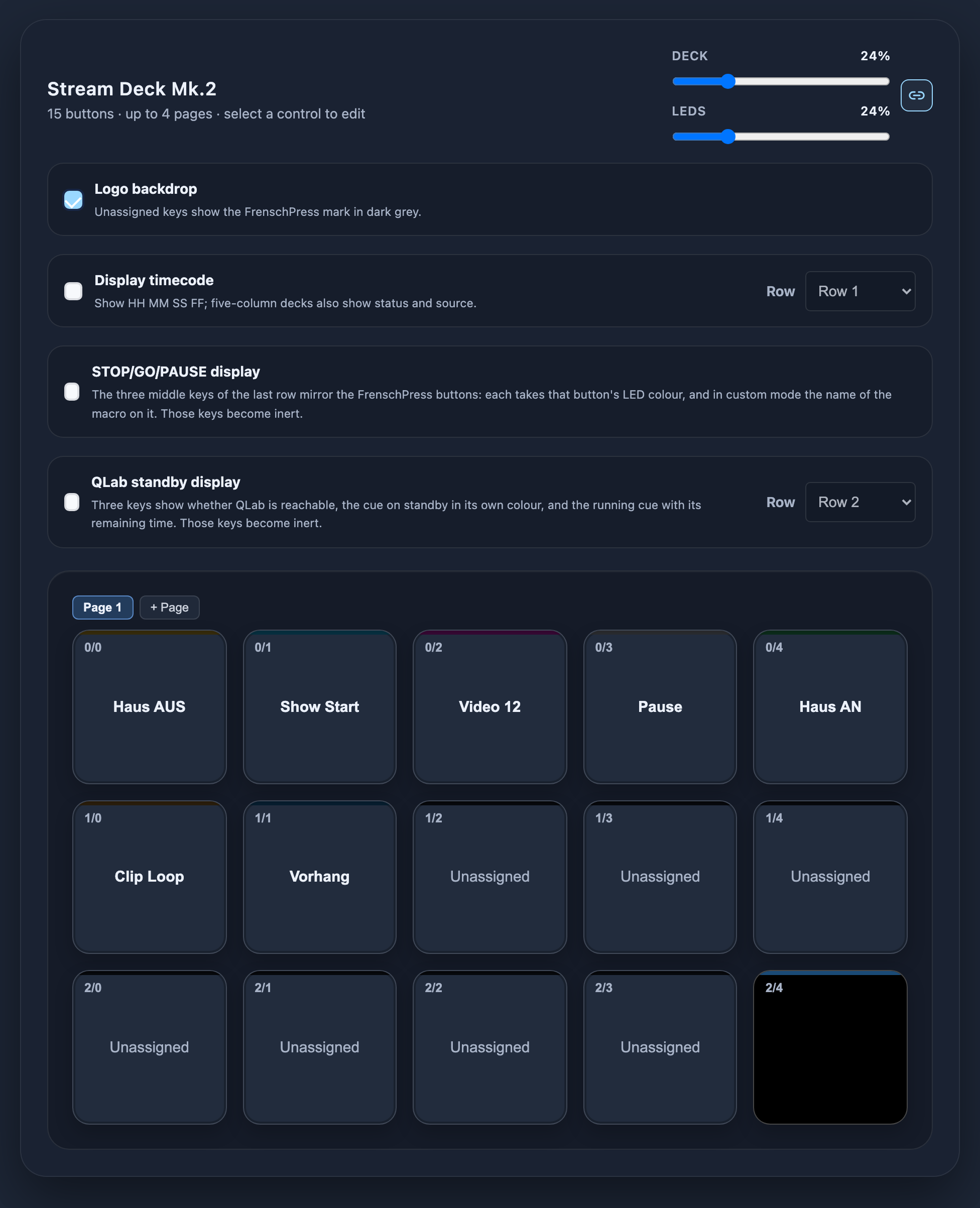
Device card
| Control | Function |
|---|---|
| Deck / LEDs | Two brightness faders, 0–100 %, linkable with the link button |
| Logo backdrop | Draws the FrenschConnection logo across unmapped, unlabelled keys as one continuous graphic |
| Timecode display | Reserves a key row as a timecode readout — including row selection, digit colours and display size |
| STOP/GO/PAUSE display | Mirrors the three device buttons onto the deck |
| QLab standby display | Shows the standby cue and the running cue from QLab — including row selection |
All three displays are described under Display rows.
By default the deck and the panel LEDs run on one shared value. Every control then moves the same number: the faders here, the LED slider in settings, hold STOP + turn the encoder, the BRT+/BRT- keys in the on-deck menu, and a Companion BRIGHTNESS message.
The link button next to the two faders breaks that coupling. The deck then keeps its own level and the LEDs keep theirs — meant for a deck sitting under a work light while the LEDs run in a blacked-out house.
The deck receives its value mapped onto its own 0–100 scale with a floor of 10 %, so its EXIT key stays readable even when the LEDs are dimmed further.
Mapping keys
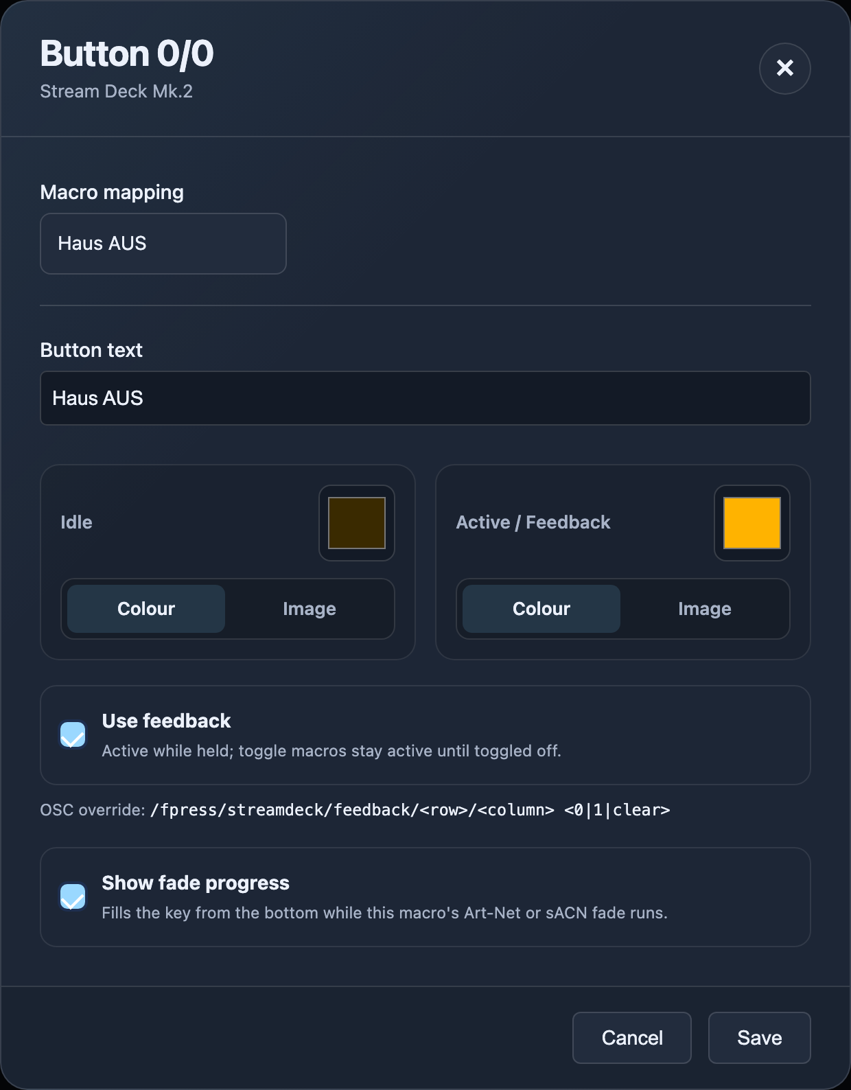
Clicking a key in the grid opens the editor dialog.
| Field | Description |
|---|---|
| Macro | Select a macro or create one via Quick Create / Multi-Step — identical to Custom Mode |
| Button text | Label. The field accepts up to 48 characters, but far less fits on a key — see Text rendering |
| Idle | Colour or image for the resting state |
| Active / Feedback | Colour or image for the active state |
| Invert idle | Derives the feedback image from the idle image, inverted — see Key images |
| Show fade progress | Shows a running Art-Net/sACN fade as a bar on the key — see Fade display |
| Feedback | Enables/disables state switching for this key |
The browser preview shows every key with its text and a thin colour bar at the top reflecting the current state (idle or active) — including a retained toggle state after key release.
Colour and feedback model
| Situation | Behaviour |
|---|---|
| Feedback off | The key stays idle at all times |
| Normal macro, feedback on | Active while the key is held, back to idle on release |
| Toggle macro / toggle sequence | Active is retained after release and returns to idle when toggled off |
| Unmapped or failed | Stays idle — there is no separate error colour |
After every reconnect the full desired state is rewritten, because a Stream Deck loses its display contents when disconnected.
Setting feedback over OSC
A deck key's state can also be set from outside — useful when the truth about "on or off" lives in the target system rather than in the FrenschPress. A lighting console can colour the key that fires its scene.
The commands are documented under OSC remote control: /fpress/streamdeck/feedback for one key, /fpress/streamdeck/feedback/all for all of them, and /fpress/streamdeck/feedback/clear to hand control back to the key itself. A page switch drops any overrides in place.
Text rendering
A few practical rules:
- One word per line, at most 6 lines — so six words maximum. Wrapping happens on spaces.
- Realistically about 5 characters fit per line in the large face (three such lines on a 72 px key). A longer word drops the whole label to the small face (around 11 characters per line), so short words stay considerably more readable.
- A space is a deliberate line break — that is how you put a caption over a value.
- A word that does not fit even at the smallest size is truncated, not wrapped.
- ASCII 32–126 is supported including lowercase; anything else becomes
?. - Text colour is derived automatically from the background luminance so contrast stays correct.
- Keys in a group (macro labels, the menu) render at one shared glyph size, so a page is not built from five different sizes.
If a host cannot transfer images at all, the key is filled with the background colour instead. The configuration remains valid either way.
Key images
Idle and Active/Feedback can carry an image instead of a colour. In the editor, switch the relevant card from Colour to Image and pick a file via Choose image….
All the preparation happens in the browser:
- Any image format the browser can open (PNG, JPG, …) is accepted.
- The image is cropped square from the centre (never squashed) and scaled to the key's pixel size.
- Transparent areas of a PNG take the colour of that slot as their background.
- The label is rendered into the image — light on dark, dark on light, each with an outline. The text can be changed later without picking the file again.
- The result is stored as a JPEG, compressed automatically until it fits the 8 KB per key limit.
Invert idle derives the feedback image from the idle image — inverted, with no second file needed.
Fade display
With Show fade progress enabled in the key editor, the key fills from the bottom while an Art-Net or sACN fade belonging to that macro runs.
The bar's height is the current output level, not elapsed time:
| Situation | Bar |
|---|---|
| Fading in | rises |
| Fading out | falls |
| Pressed mid-fade | reverses out of its current height instead of jumping |
| Fade finished | the key returns to its normal look |
It is drawn in the key's own colours: idle colour as the background, active colour as the fill, with the label still readable. Snapshot fades are shown the same way.
The option is greyed out as soon as the key carries an image — a bar cannot be drawn over a picture. It is off by default.
The bar also appears when using the encoder as a master fader: while you turn, the key shows the level you have set.
Display rows
Three readouts can claim keys on the deck: timecode, STOP/GO/PAUSE and QLab standby. All three are switched on from the device card.
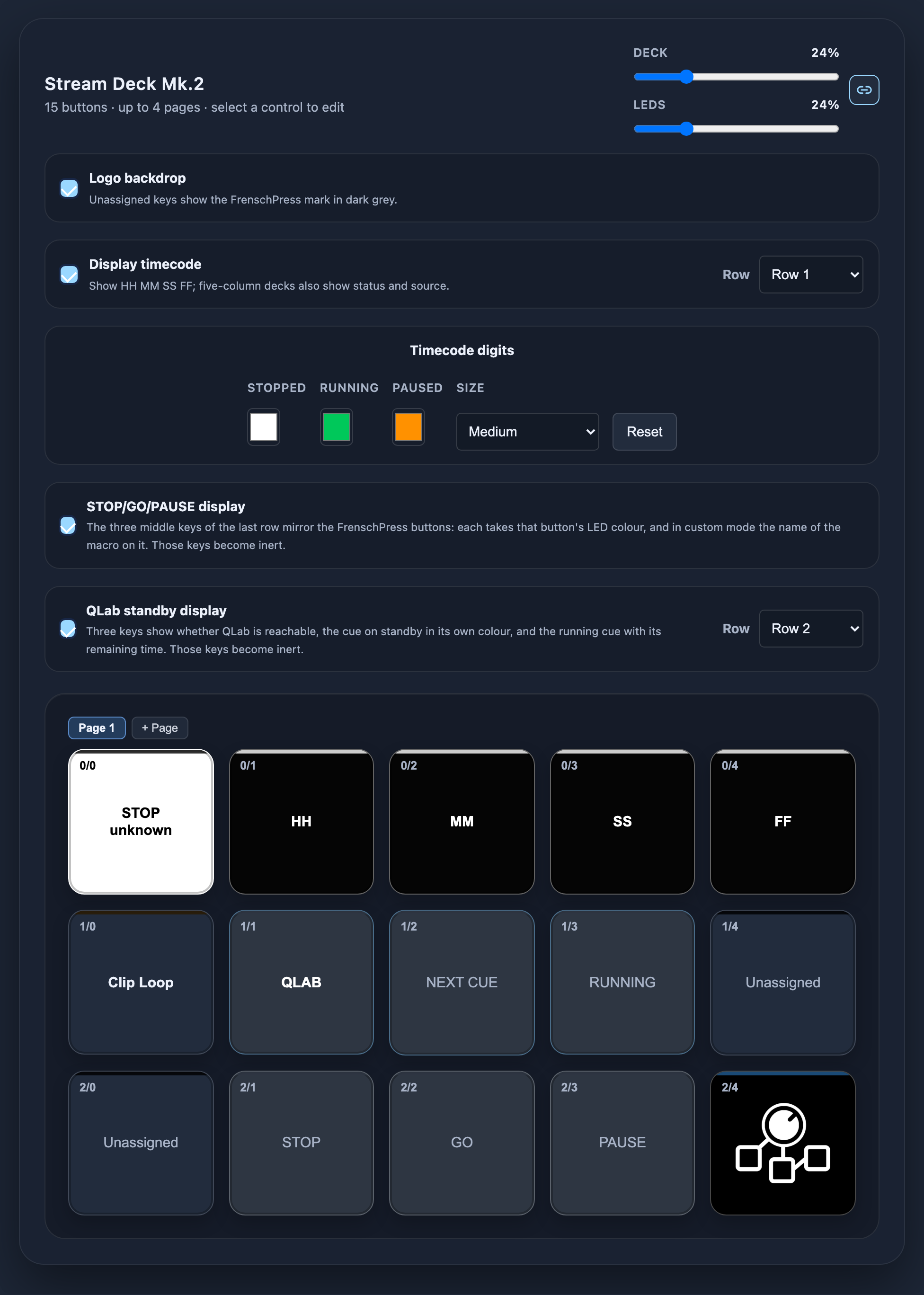
Reserved keys run no macros — neither physically nor over OSC. Their stored mappings stay intact and return as soon as the readout is switched off or moved to another row.
On the Stream Deck +, STOP/GO/PAUSE and QLab claim no keys — they live in the window.
Timecode
With Timecode display on, the selected row reserves its keys as a readout:
| Deck width | Layout |
|---|---|
| 4 columns | HH MM SS FF |
| 5+ columns | STATUS/SOURCE HH MM SS FF |
- The status/source field has a white background with black text and names the source: USB 1, USB 2, MTC Master or Art-Net.
- The four numeric fields are black; the digits are white (stopped), green (running) or orange (paused).
- Values are updated locally on USB 2 from the running MTC stream — only digits that changed are redrawn.
The last row is not offered: its lower-right key is permanently reserved for the tools menu. If the timecode row would reach into the page-key column on a multi-page deck, the status/source field is dropped automatically.
Colours and style
The digit colours for Stopped, Running and Paused are freely configurable; Reset restores the defaults.
Size selects the rendering:
| Setting | Rendering |
|---|---|
| Medium | Standard face |
| Large | Large face |
| Digital clock | Clock-style digits |
| Digital clock large | Clock style, large face |
STOP/GO/PAUSE
The middle three keys of the last row mirror the three device buttons: each takes the LED colour of its button, and in Custom Mode also the name of the macro sitting on it.
That way the deck shows what the console is doing without looking back at the device.
The readout needs a deck at least five columns wide; on the Stream Deck + it lives in the window.
QLab standby
Three keys of the selected row show what QLab is doing:
| Field | Content |
|---|---|
| Link | Whether QLab is reachable |
| Standby | The cue on standby — number and name, in that cue's own colour |
| Running | The running cue with its remaining time |
The readout only works when the FrenschPress is connected to QLab over OSC (see QLab Mode – network connection). MIDI/MSC has no return channel.
If QLab stops answering for more than a second and a half, the Link field turns red and the other two fields freeze on their last state — so a lost connection is distinguishable from a show simply standing still.
The readout needs a deck at least four columns wide; on the Stream Deck + it lives on the touchbar.
Stream Deck +
The Stream Deck + adds four knobs and a touch strip.
| Control | Can be mapped to |
|---|---|
| Encoder push | Its own macro (press/release like a key) |
| Encoder CW / CCW | One macro each, executed per detent |
| Touch strip | Four fields with text labels; tap, long tap, swipe left/right |
Each touch strip field is laid out by the zones actually in use — an encoder used only for turning gets the full height for its two directions instead of a blank band:
push + turns          turns only           push only
+----------------+    +--------+-------+   +----------------+
| PUSH           |    |  CCW   |  CW   |   |                |
+--------+-------+    |        |       |   | PUSH           |
|  CCW   |  CW   |    +--------+-------+   |                |
+--------+-------+                         +----------------+
Touch gestures are deliberately additive: every gesture is also reachable from a knob or a key. Glass gives no tactile feedback, and a mis-touch during a show is expensive.
Touchbar views (carousel)
The touchbar always shows exactly one view. A swipe left or right steps to the next one:
| View | Appears when |
|---|---|
| Encoder labels | an encoder on the active page is mapped |
| Timecode | the timecode readout is switched on |
| STOP/GO/PAUSE | the STOP/GO/PAUSE readout is switched on |
| QLab standby | the QLab standby readout is switched on |
Only enabled views are in the carousel. With just one enabled, swiping does nothing. Small chevrons at the edges indicate that there is something to swipe to.
The selected view is remembered and comes back after a restart, after closing the tools menu, and after unlocking.
On the Stream Deck +, STOP/GO/PAUSE and QLab cost no keys — the window is their home. On every other deck they claim a row.
Pages
A deck can hold up to four pages.
| Property | Per page | Shared |
|---|---|---|
| Key and encoder mappings | ✔ | |
| Key images | ✔ | |
| Brightness | ✔ | |
| Display rows | ✔ | |
| Reserved keys | ✔ |
- Pages work on every supported deck.
- From two pages on, a deck with at least three rows reserves two keys in the last column above the tools key:
PG+on the first row,PG-on the second. Both show the current position (PG+ 2/4) and wrap around. - On decks whose rows cannot carry those keys (two-row decks such as the Stream Deck +), a short press on the tools key steps one page forward. Holding it still opens the tools menu.
- A page switch releases keys that are physically held: their release action runs, and pending encoder turns, queued images and OSC feedback overrides are dropped. This is necessary because a release slot is addressed by key index, and that index means a different macro after the switch.
- Toggle states are retained per page. A toggled-on key is active again when you page back to it. That state lives in RAM only, so a restart or a deck reconnect clears it.
- The selected page is persisted 1.5 s after the last switch; the deck comes back on the same page after a restart.
- Pages are appended, and only the last one can be removed.
Editing in the browser always applies to the active page. Selecting a different page in the browser switches the deck with it: what you edit is what the deck shows.
Lock mode
The FrenschPress lock mode has priority over everything happening on the deck.
Entering lock releases held deck macros, discards pending encoder turns and visual jobs, disables the local timecode display and clears every key. LO CK ED is then rendered across the middle three keys. Keys, encoders and virtual OSC actions are ignored until unlock — after which mappings, retained feedback, timecode and the tools key are restored from their current state.